Client: Quirk Books
Recognition: Print's Regional Design Annual
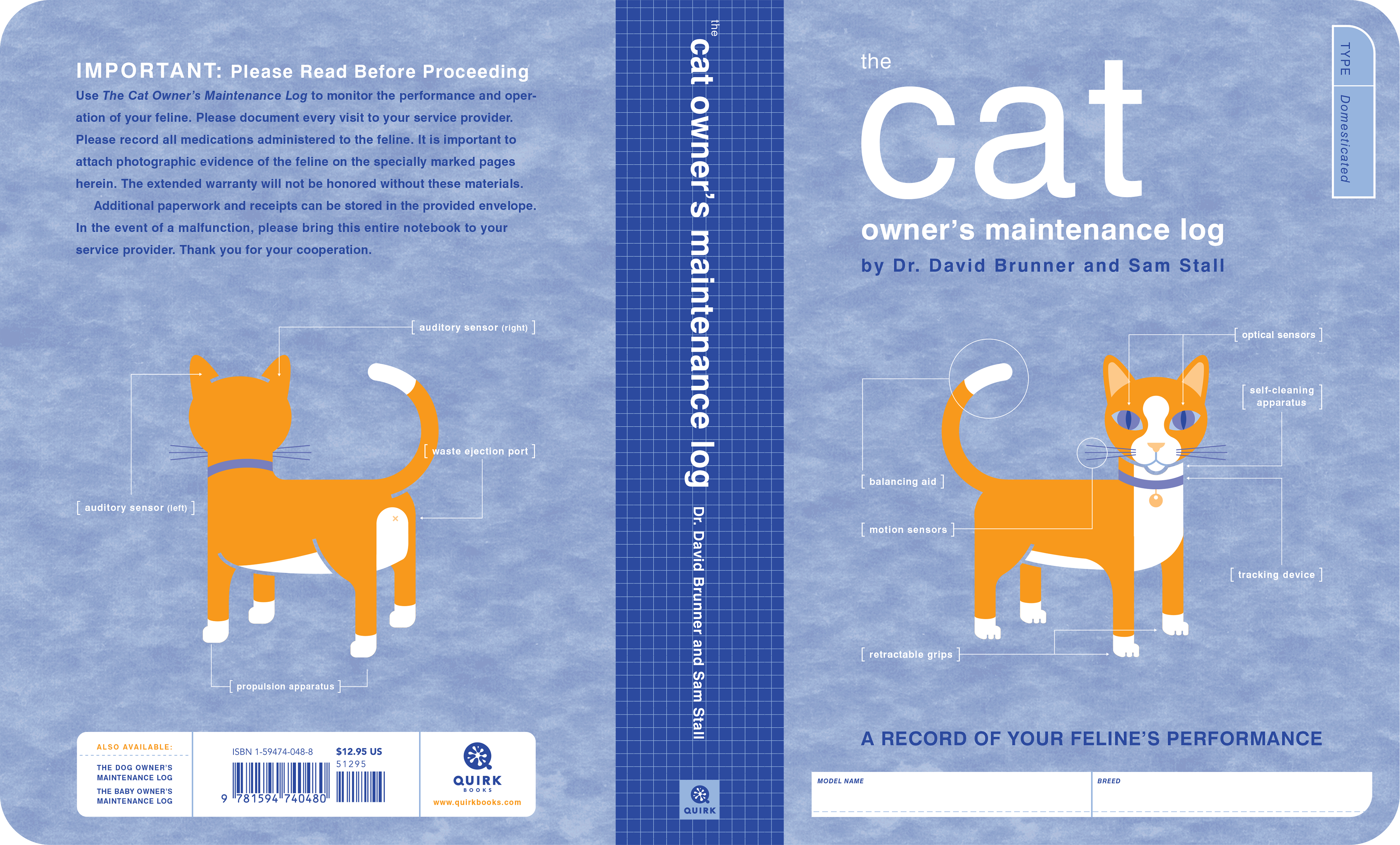
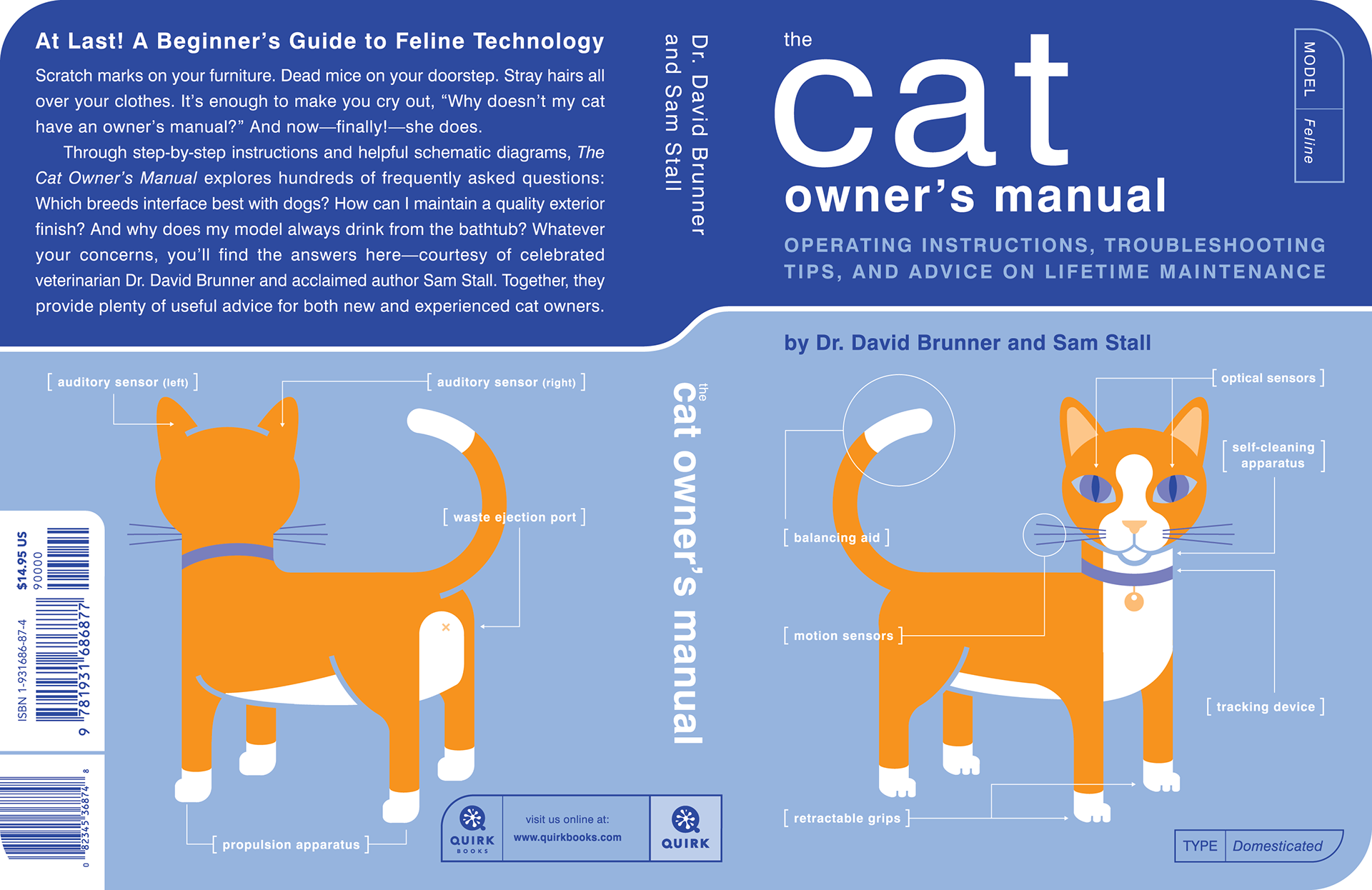
After the massive success of The Dog Owner's Manual, Quirk hired us to design and illustrate the most logical sequel: The Cat Owner's Manual.

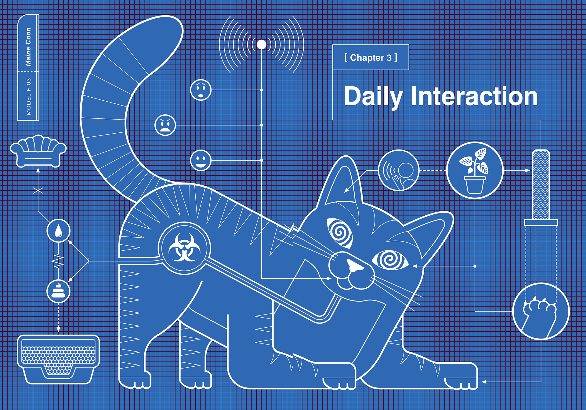
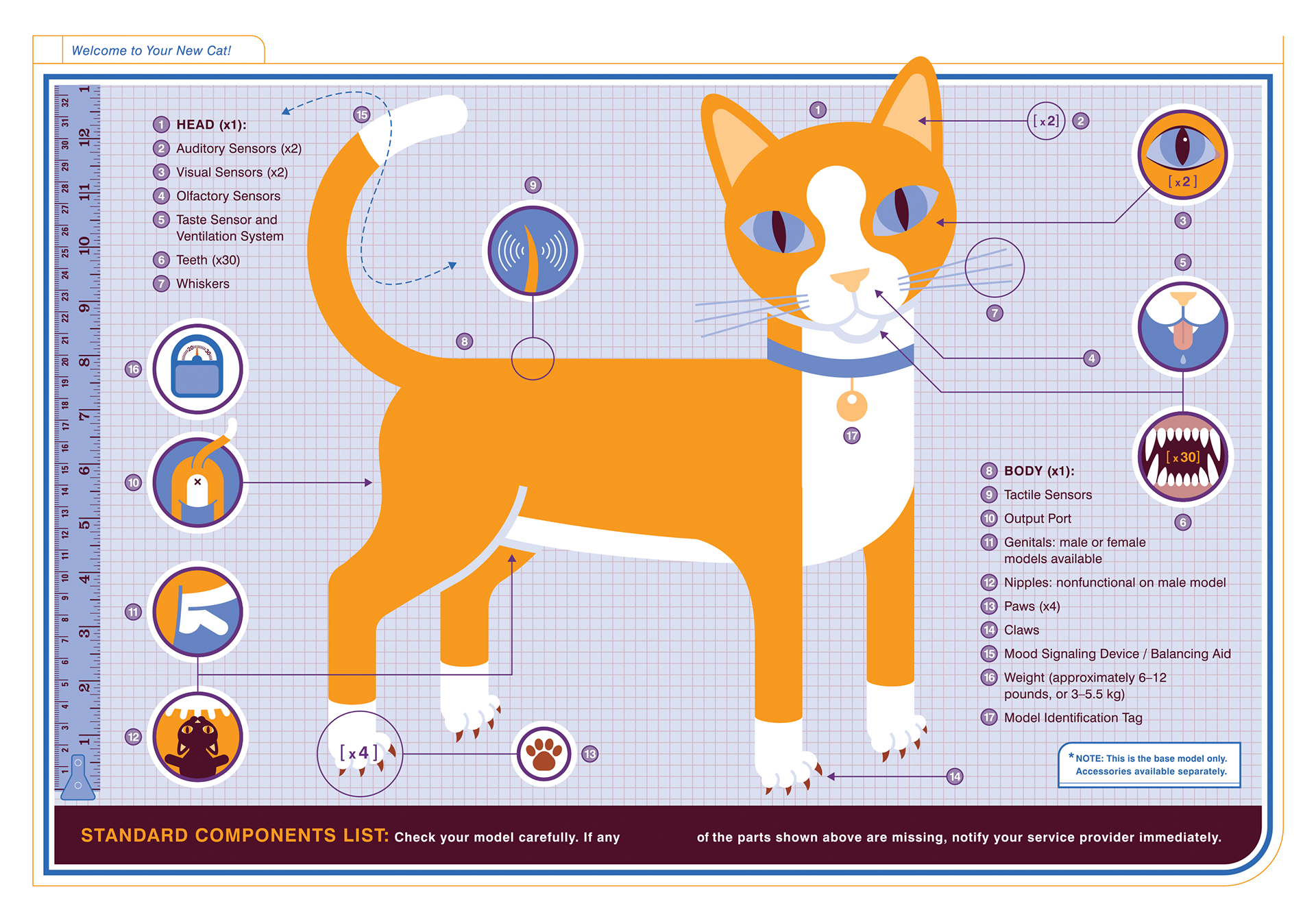
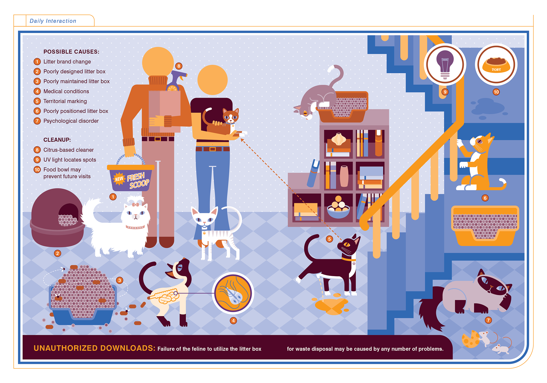
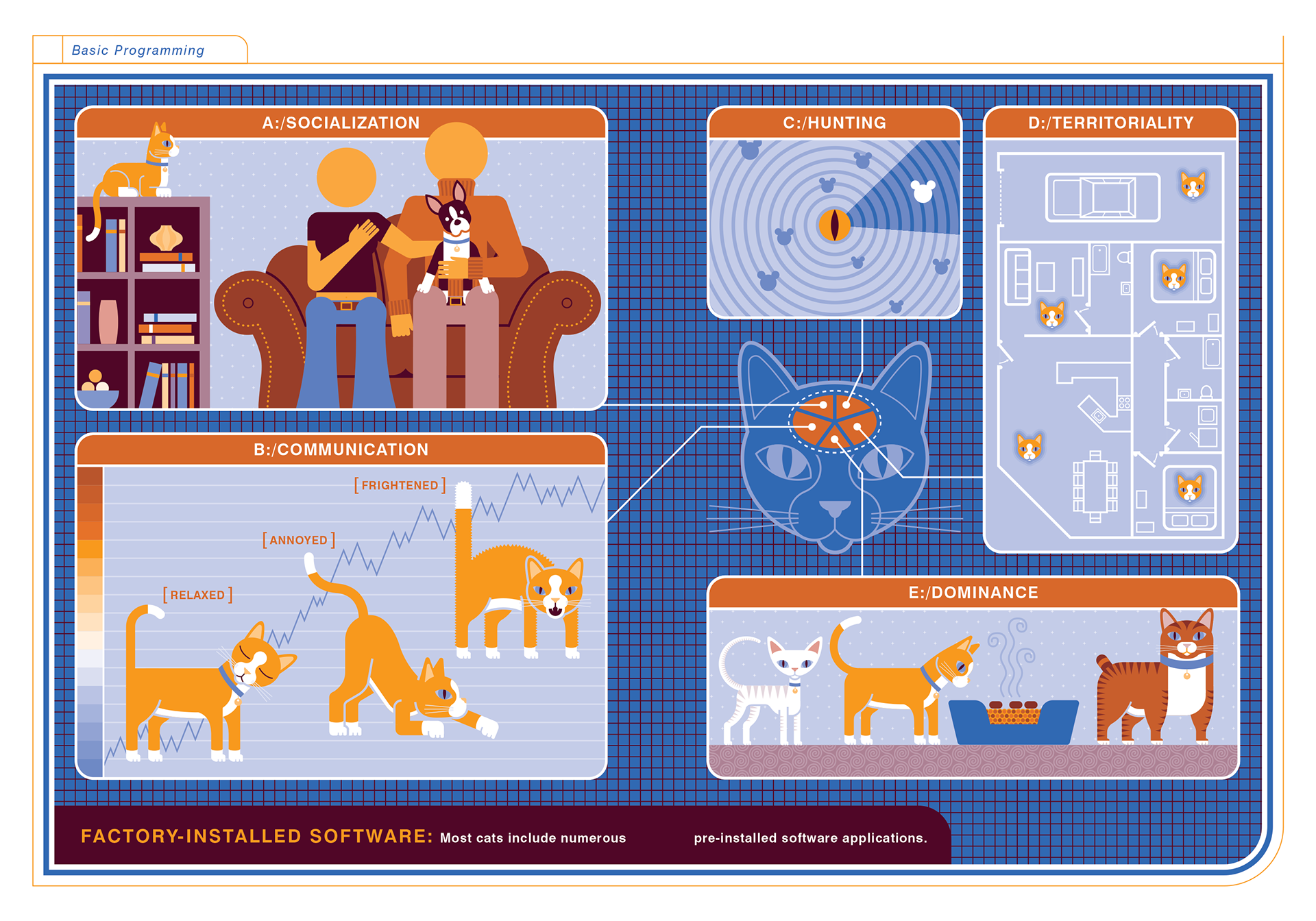
We continued many of the same design conventions as The Dog Owner's Manual, such as blueprint chapter openers, each showcasing a different breed.
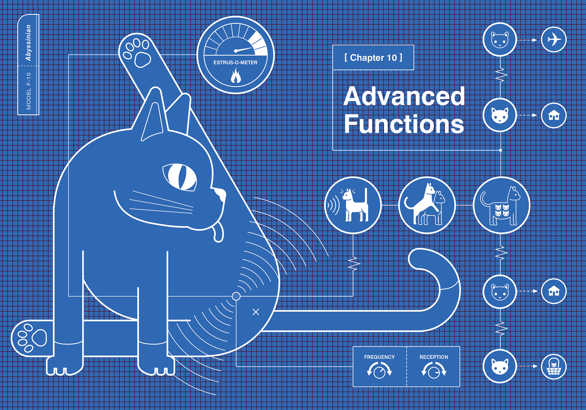
The biggest difference with this title was the color palette. The interiors of these books were printed using only two inks, so the biggest challenge was coming up with the right combination for each title. We always used the same orange ink (Pantone 144U), but the secondary color had to change for each one. Baby used something between a teal and cerulean blue, while Dog used a dark green. With Cat, we went back to blue, but chose something a little closer to a cobalt blue. Each of these colors was vibrant enough to use on its own but created a rich, dark tone when mixed at 100% with the orange ink.
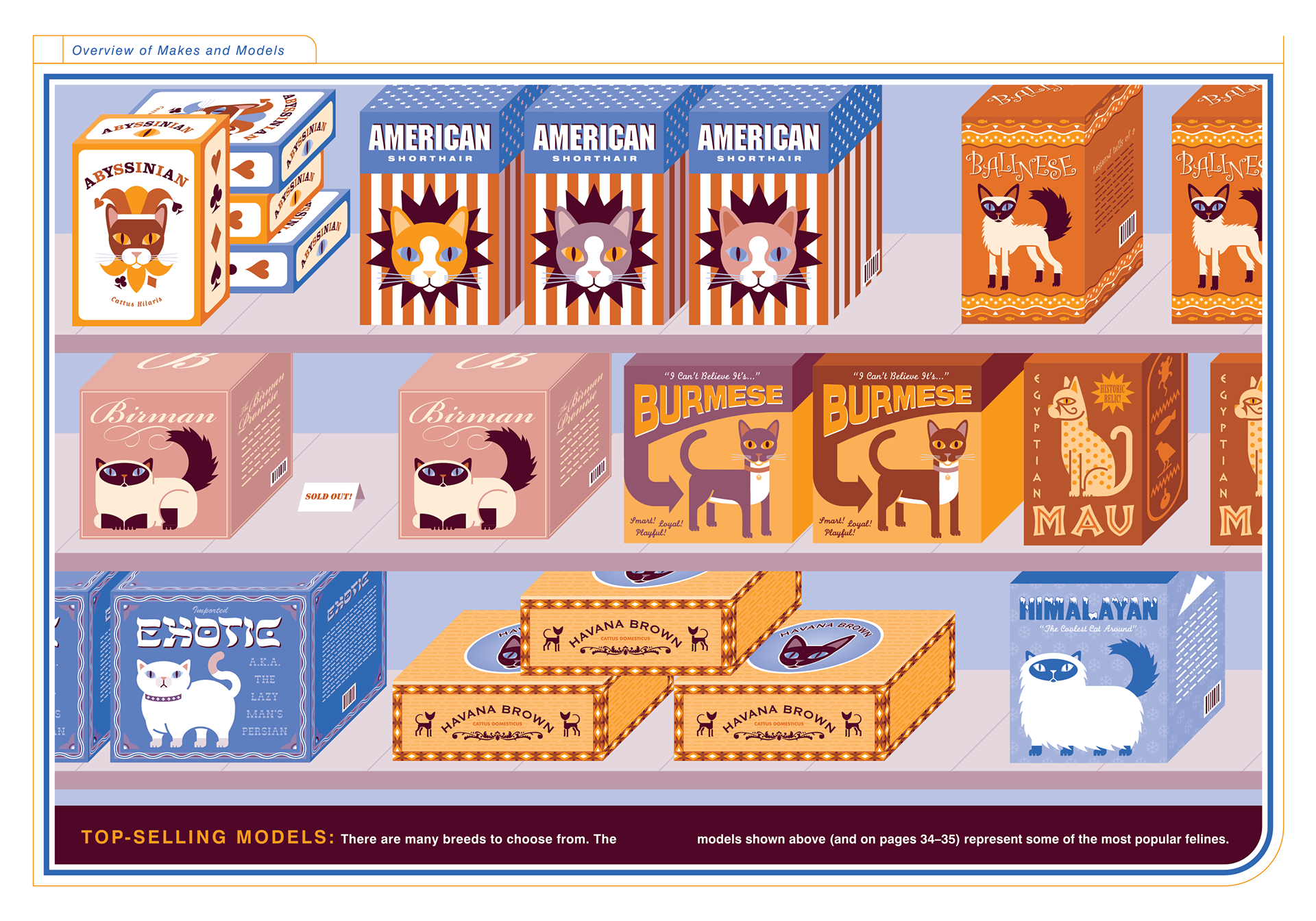
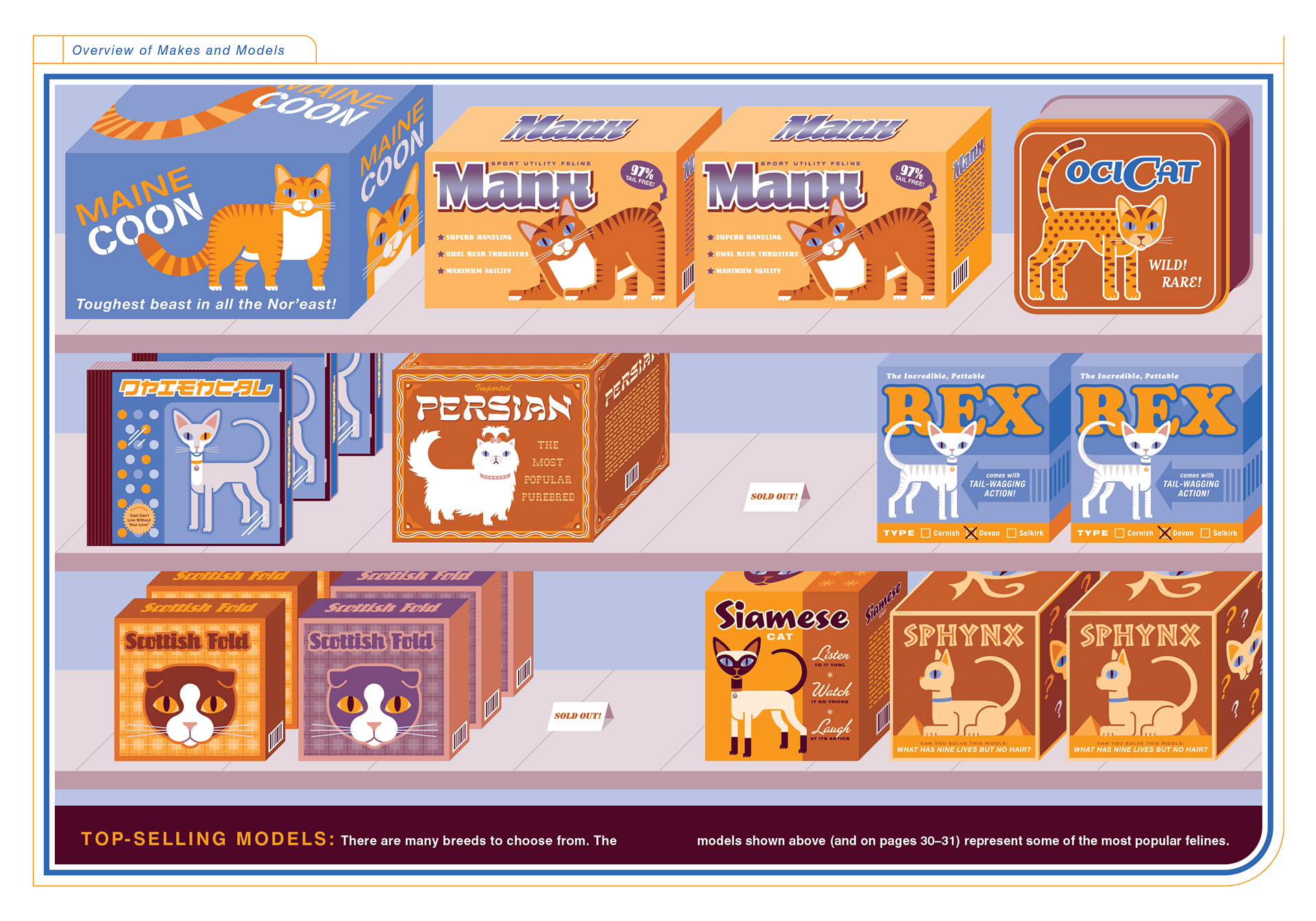
We continued the tradition of creating fake packaging for the top-selling breeds. I have to admit, when we started this book I didn't realize there were so many cat breeds. I'm a dog person, but I do have a soft spot for the hairless Sphynx.
Like The Dog Owner's Manual, this book was also a huge success and, in addition to 8 more spinoff titles, it also spawned other products such as The Cat Owner's Maintenance Log.