Client: Quirk Books
After designing and illustrating The Home Owner's Manual, it was clear to us that the "Owner's Manual" series was starting to branch out thematically from its initial concept of caretaker instruction manuals.
They were always intended to be instruction manuals, but now the topics were expanding to other life milestones beyond adopting a pet or raising a child.
The next title would be geared towards men about to take that big leap into the scary, unknown world of matrimony: The Groom's Instruction Manual.
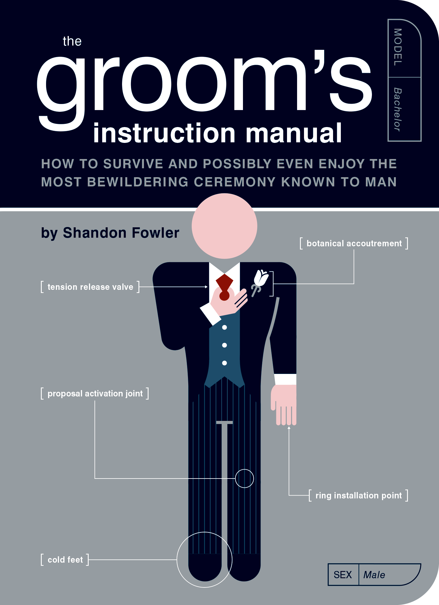
This was the first title where we did not use our orange ink (Pantone 144) inside or on the cover. For the inside we opted for a dark red / dark blue 2-color combo (the logic being we would need red for a lot of the wedding illustrations, like roses and formal wear and velvet-lined ring boxes.
For the cover our three ink choices were a red, a black, and a shiny silver ink.
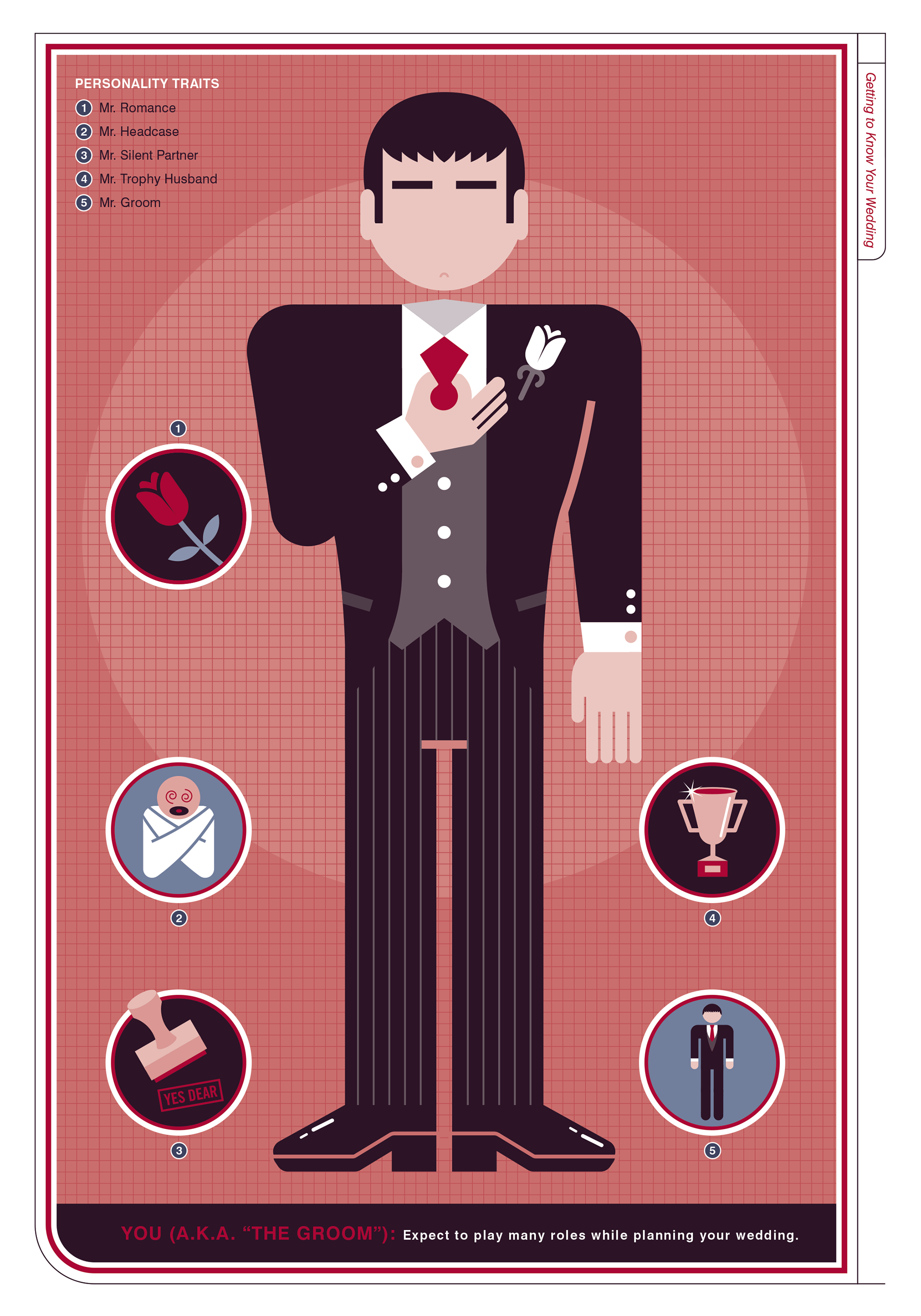
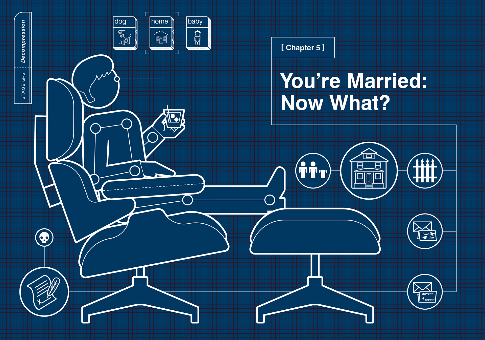
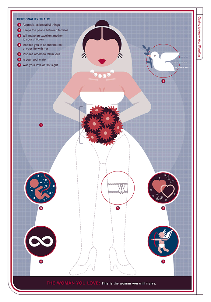
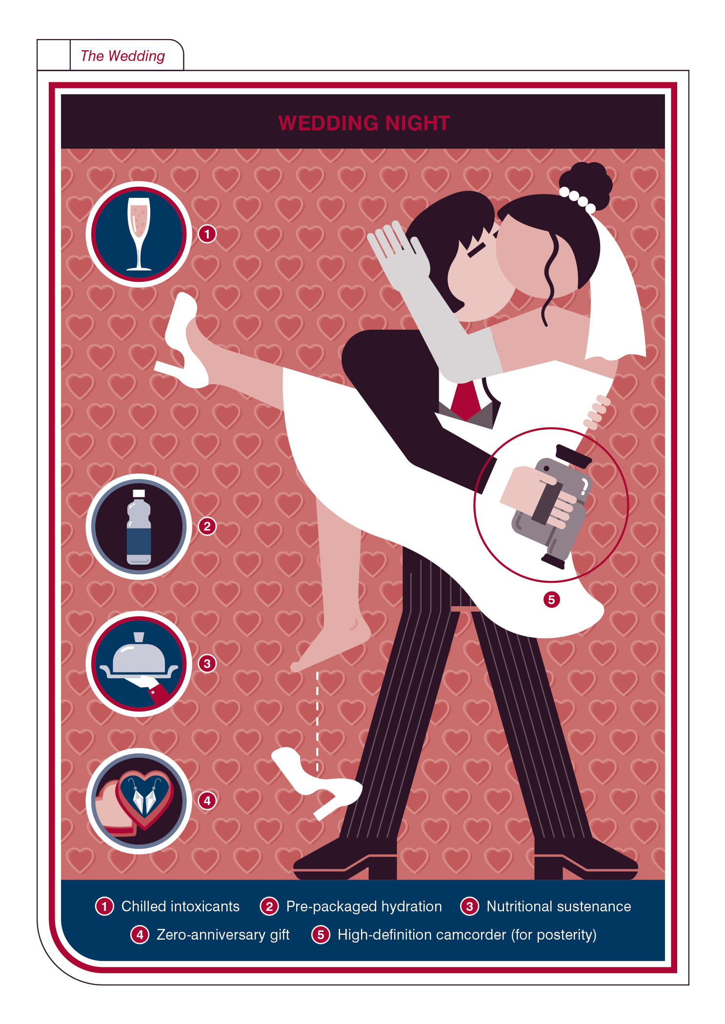
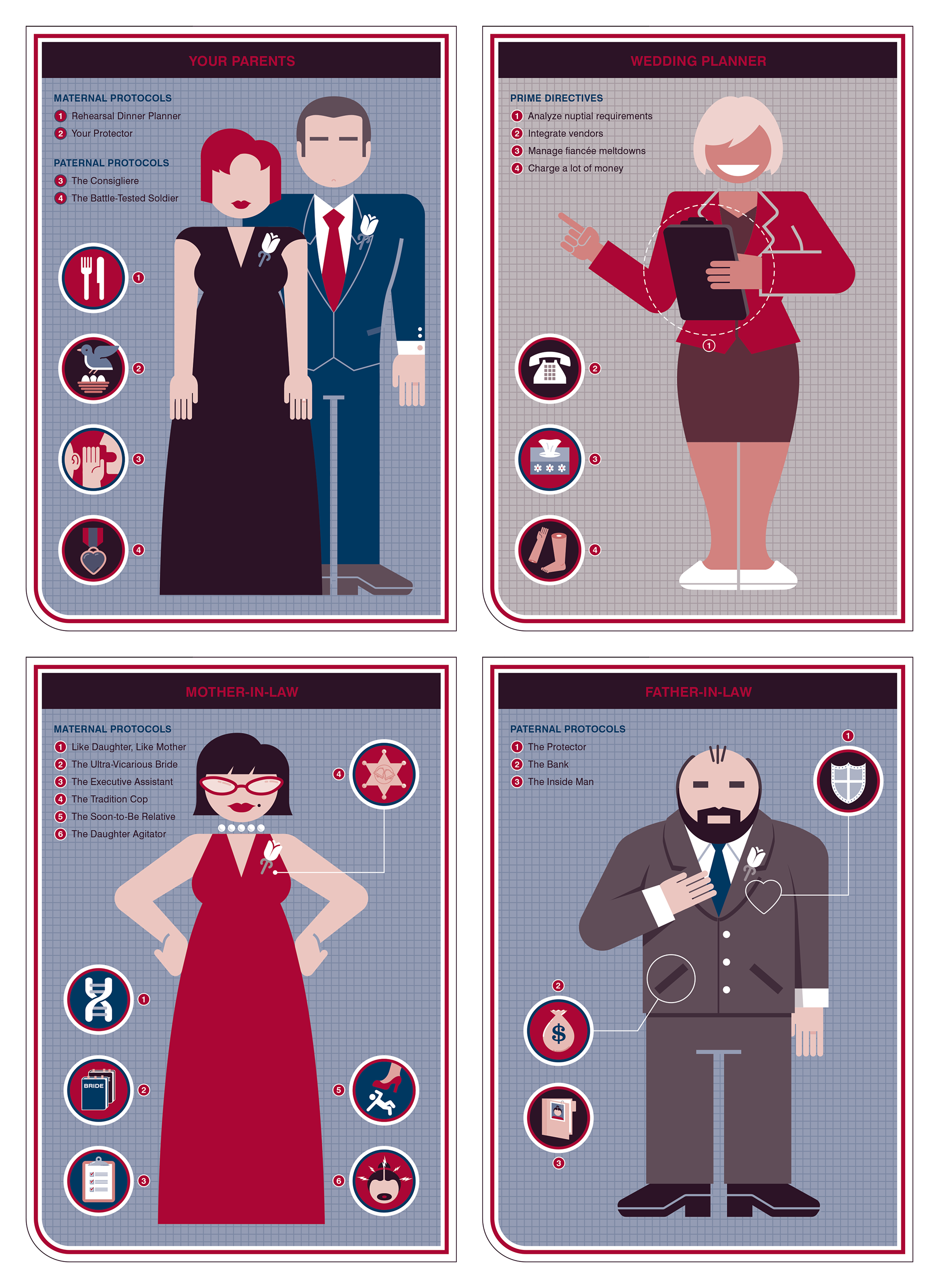
Weddings are about people: the wedding party, friends and family, esteemed guests, event staff and, of course, the happy couple tying the knot.
So it's no surprise that the majority of the illustrations were of the persons involved in that special day.
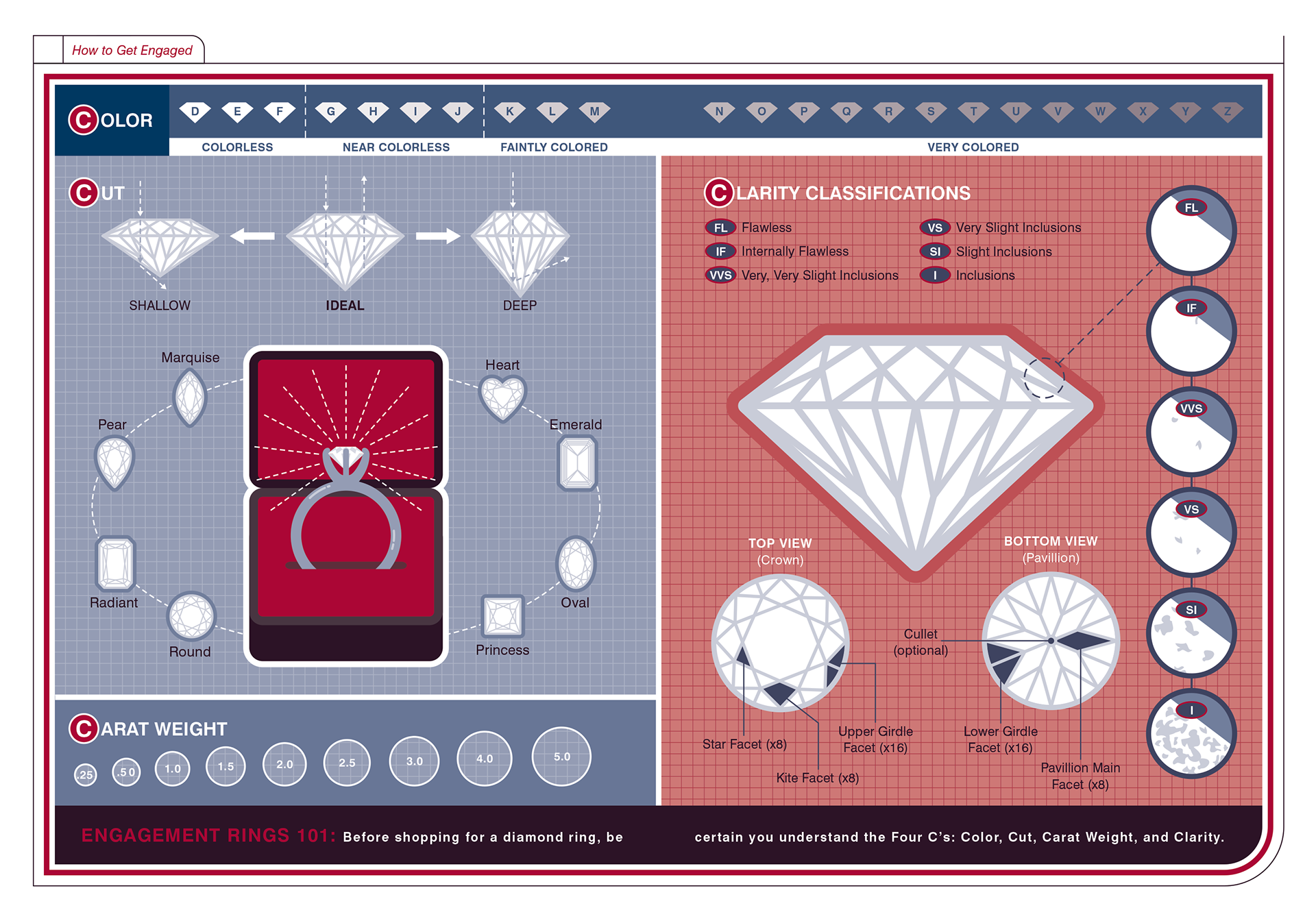
We also created infographics to help prospective grooms pick out the best diamond ring:
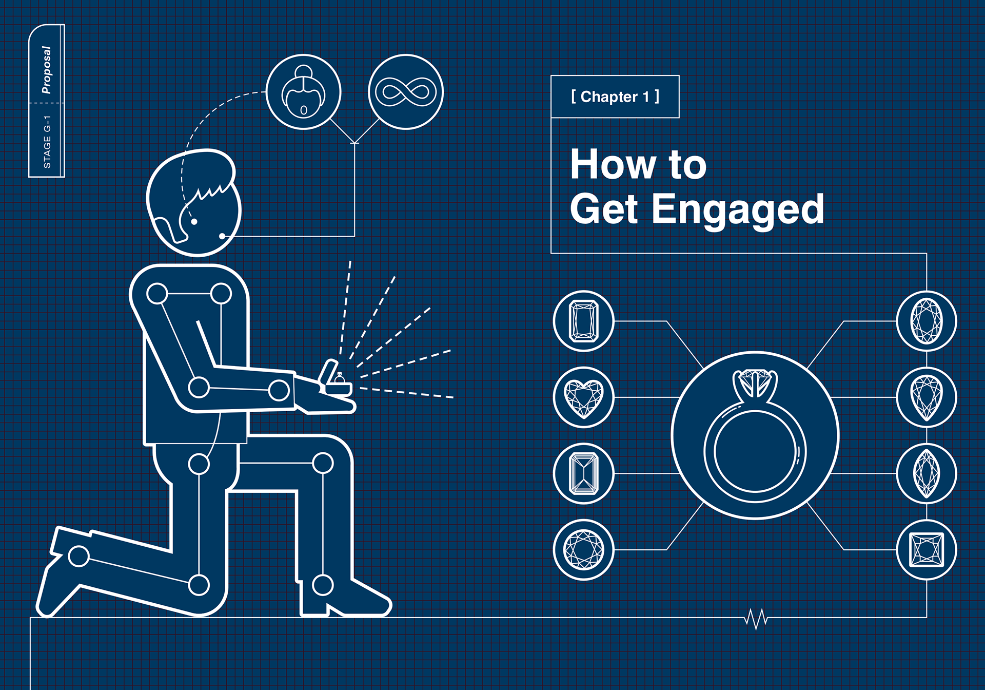
How to pop the question:
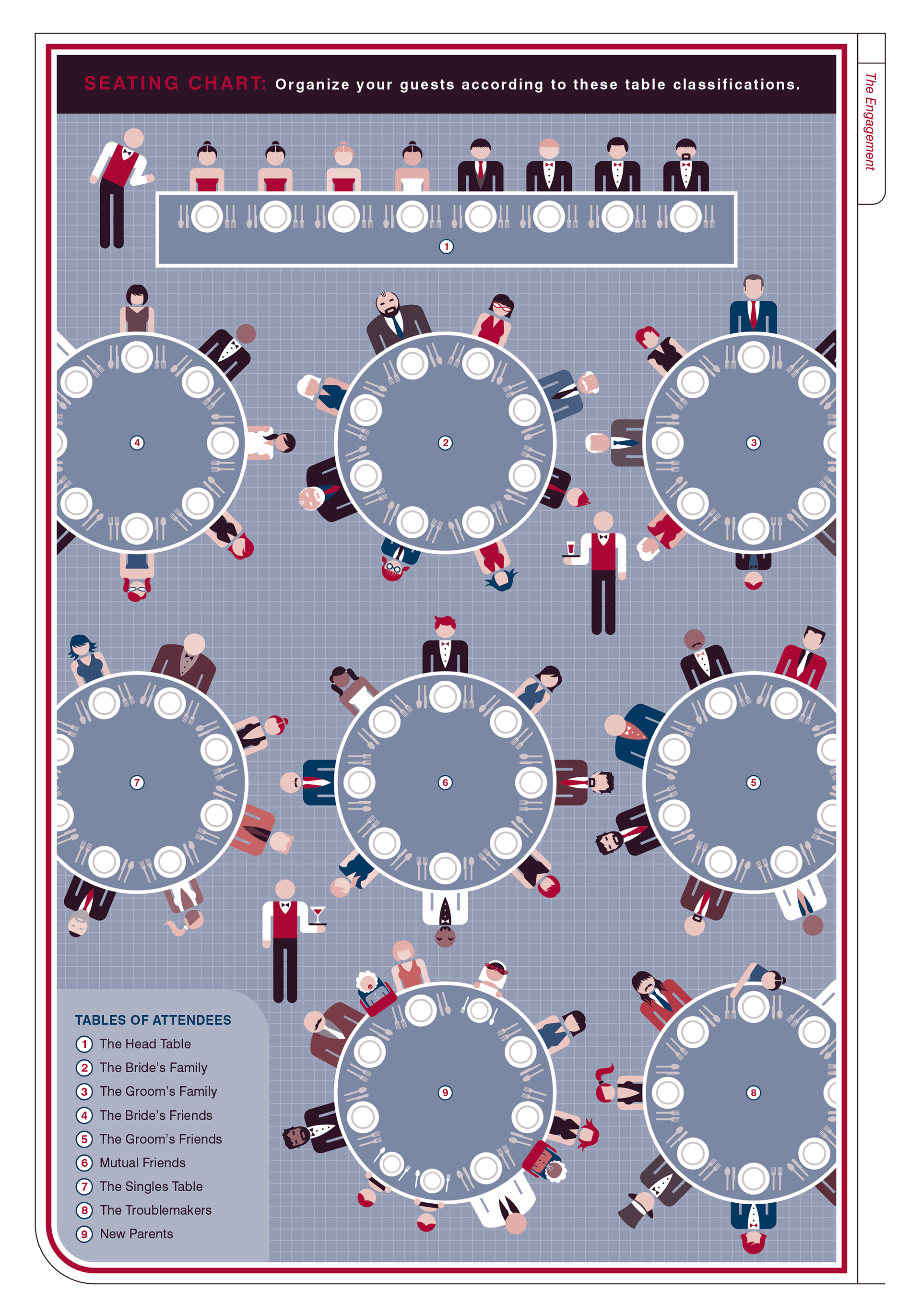
How to distribute your guests at the reception:
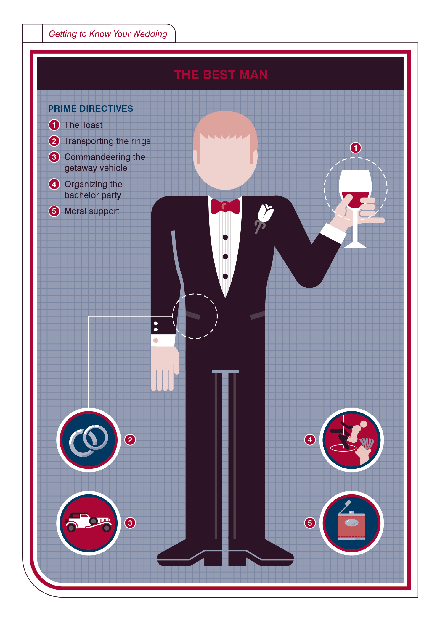
And how to choose your Best Man...
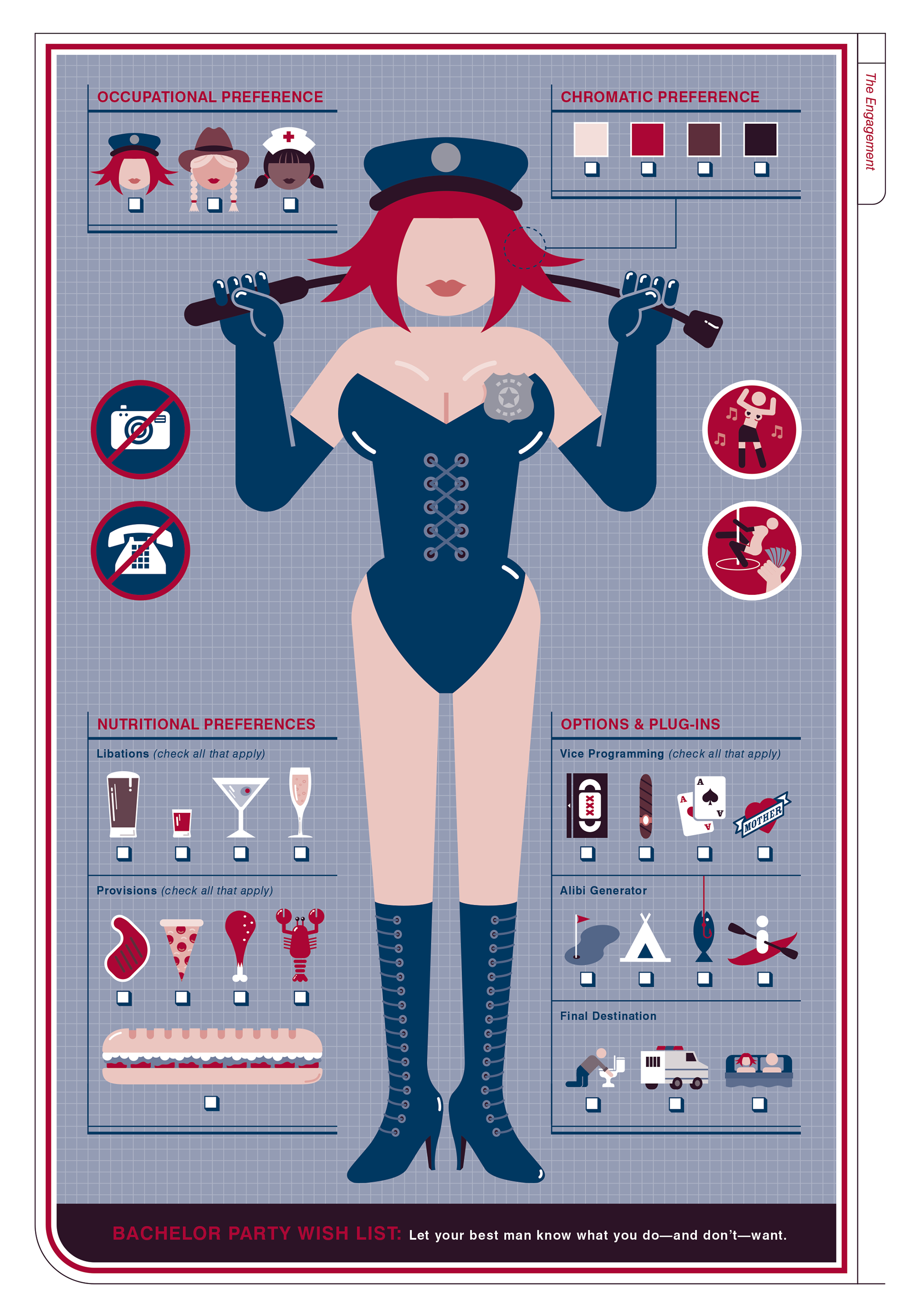
...and let him know what you do–and don't—want at your bachelor party.
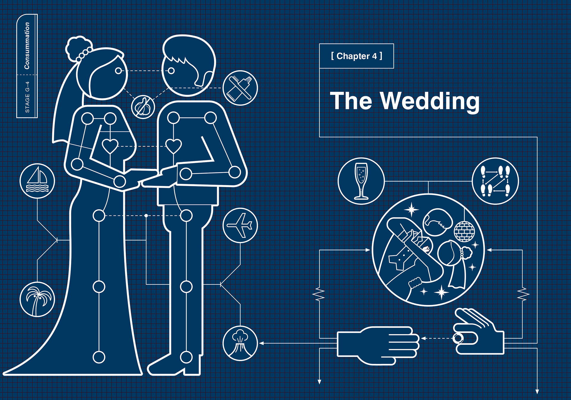
While we didn't have breed types or house styles like in previous books, we were able to keep the chapter opener tab convention by organizing the book into the "stages" of wedding planning... and consummation.
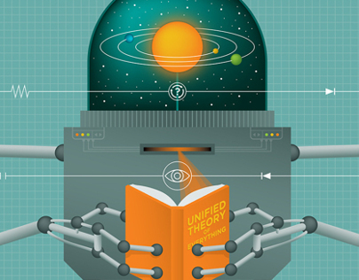
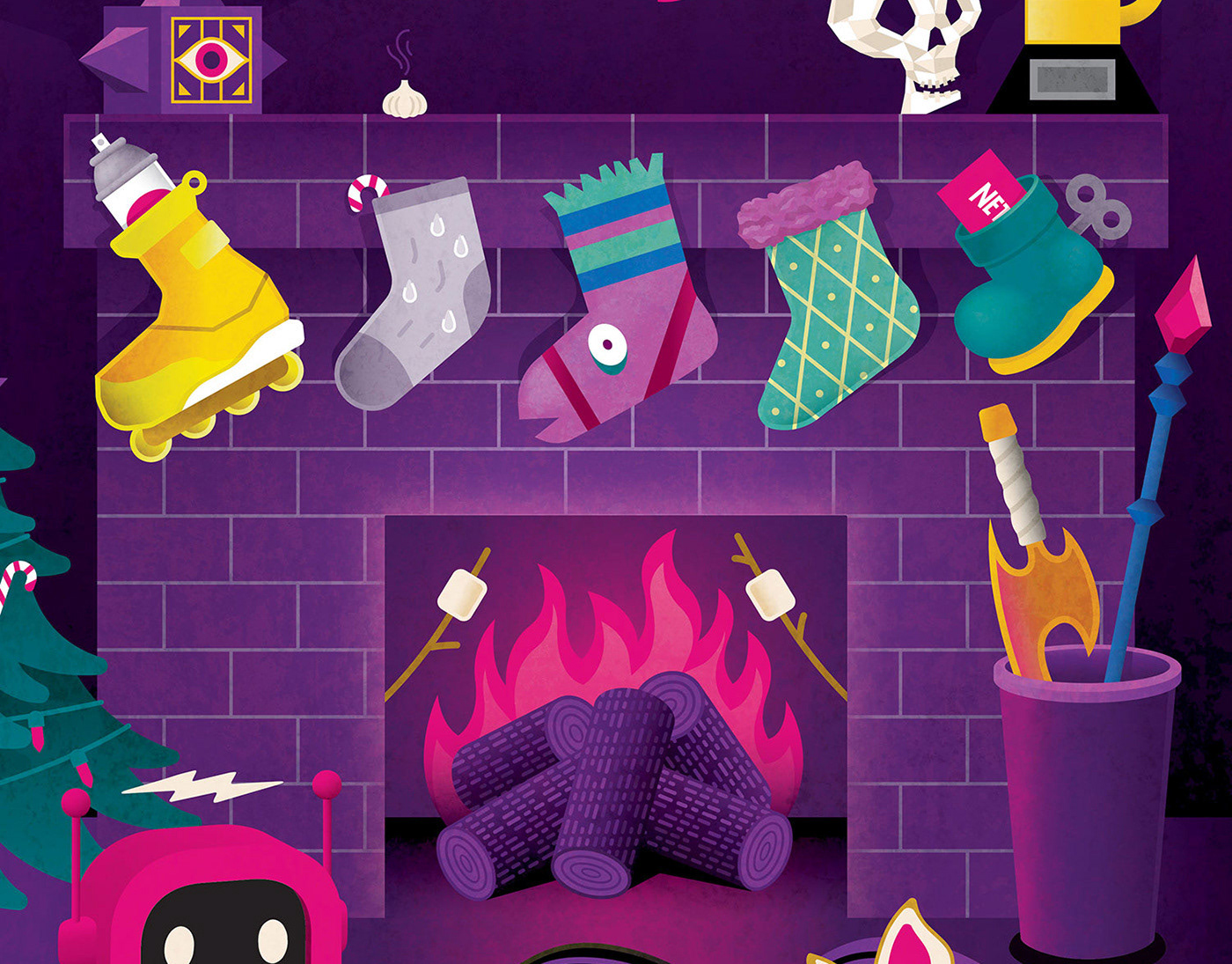
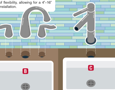
This was the sixth, and final, book in the "Owner's Manual" series that I illustrated during my six year tenure at Headcase Design. My infographic style developed a lot while working on these, and I credit this project and my collaborative work with Paul Kepple as a huge influence on where I am today.