Client: Quirk Books
Recognition: American Illustration, Print's Regional Design Annual
After four successful caretaker books in the Owner's Manual series (Baby, Dog, Cat, Toddler) we were curious about what the next topic would be. Bird? Teen? Plant?
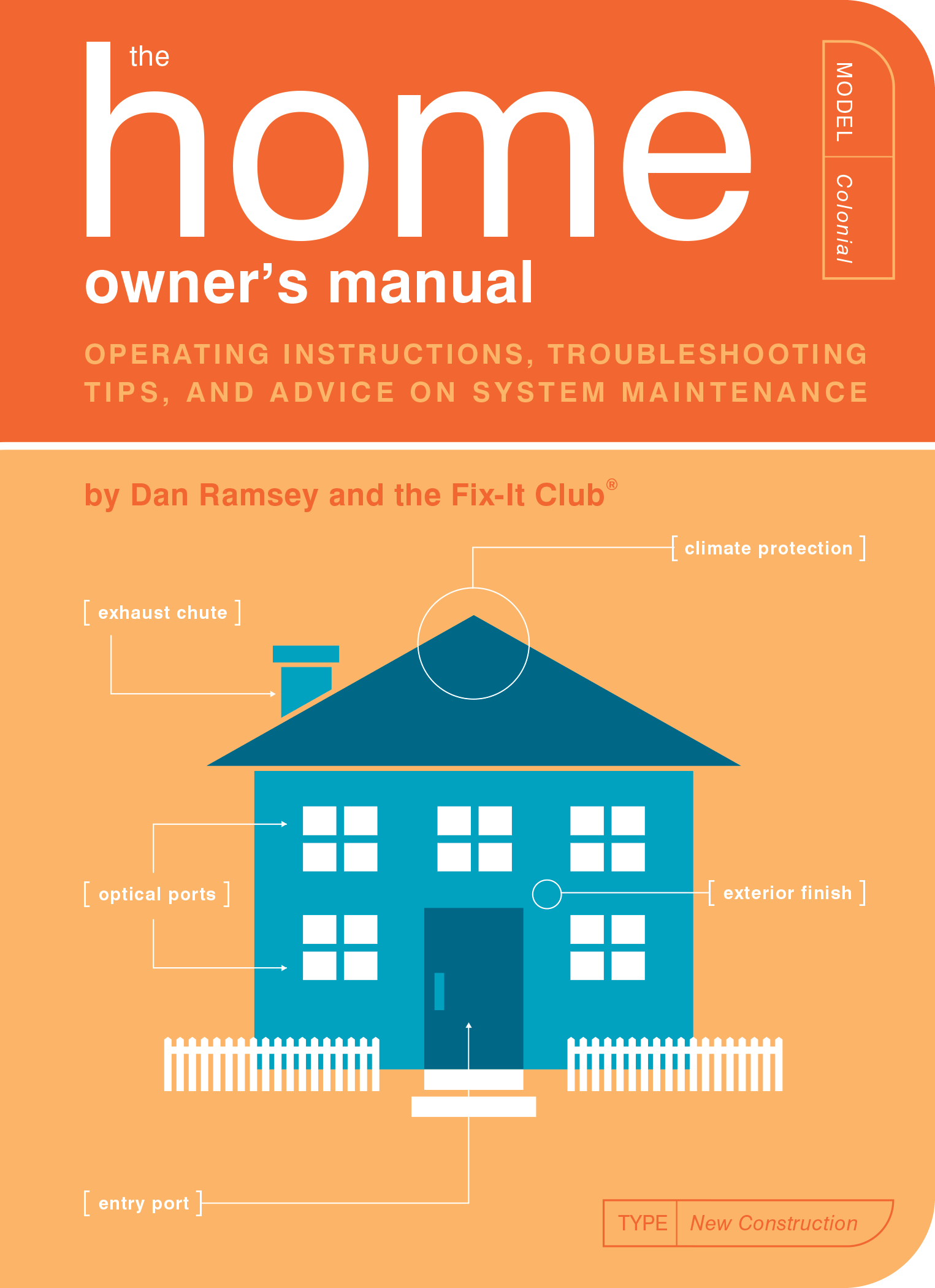
Quirk completely surprised us when they announced the next title would be: The Home Owner's Manual.
Part of what made the previous titles so unique and humorous was that most parents (human or otherwise) don't typically refer to themselves as "owners", while the phrase "homeowner" is so commonplace it doesn't even have a space between the two words!
Furthermore, the technical jargon and blueprint illustrations used for comedic effect in the previous titles are simply how one would normally talk about house-related topics.
But we kept an open mind, and it ended up being a very fun title to design.
With this title, we ended up using a similar 2-color ink combo for the interior as The Baby Owner's Manual, but we swapped the foreground/background usage on the front.
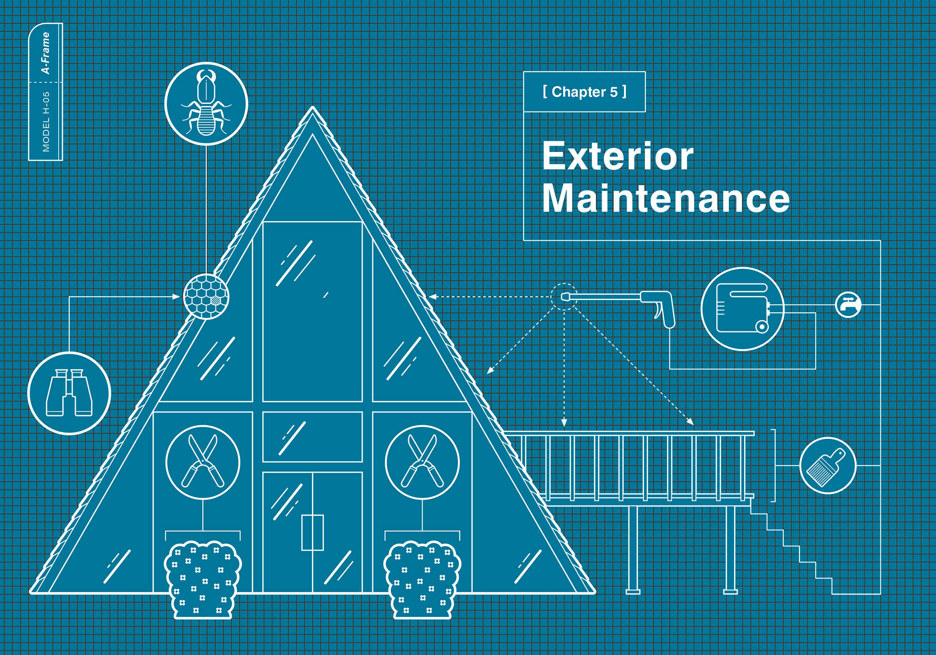
We continued to use our blueprint chapter opener concept, and were able to bring back the "breed" tab from the Cat and Dog books by showing a different architectural house style on each spread.
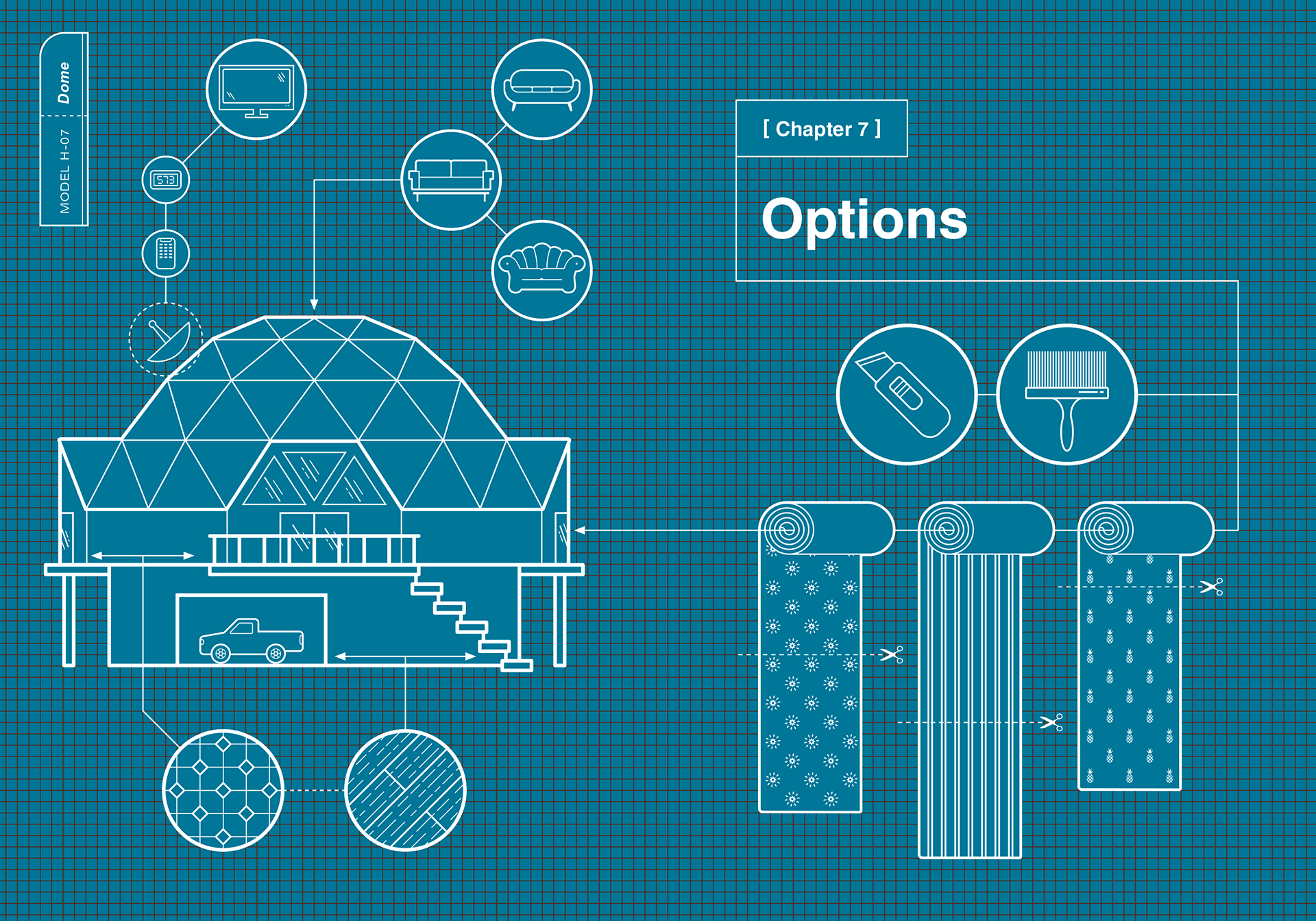
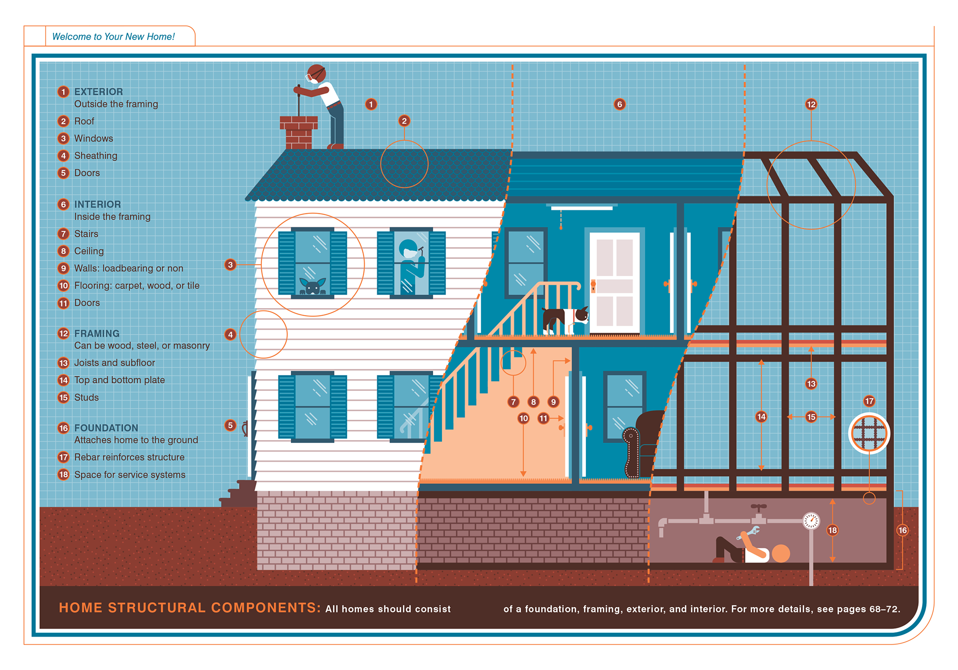
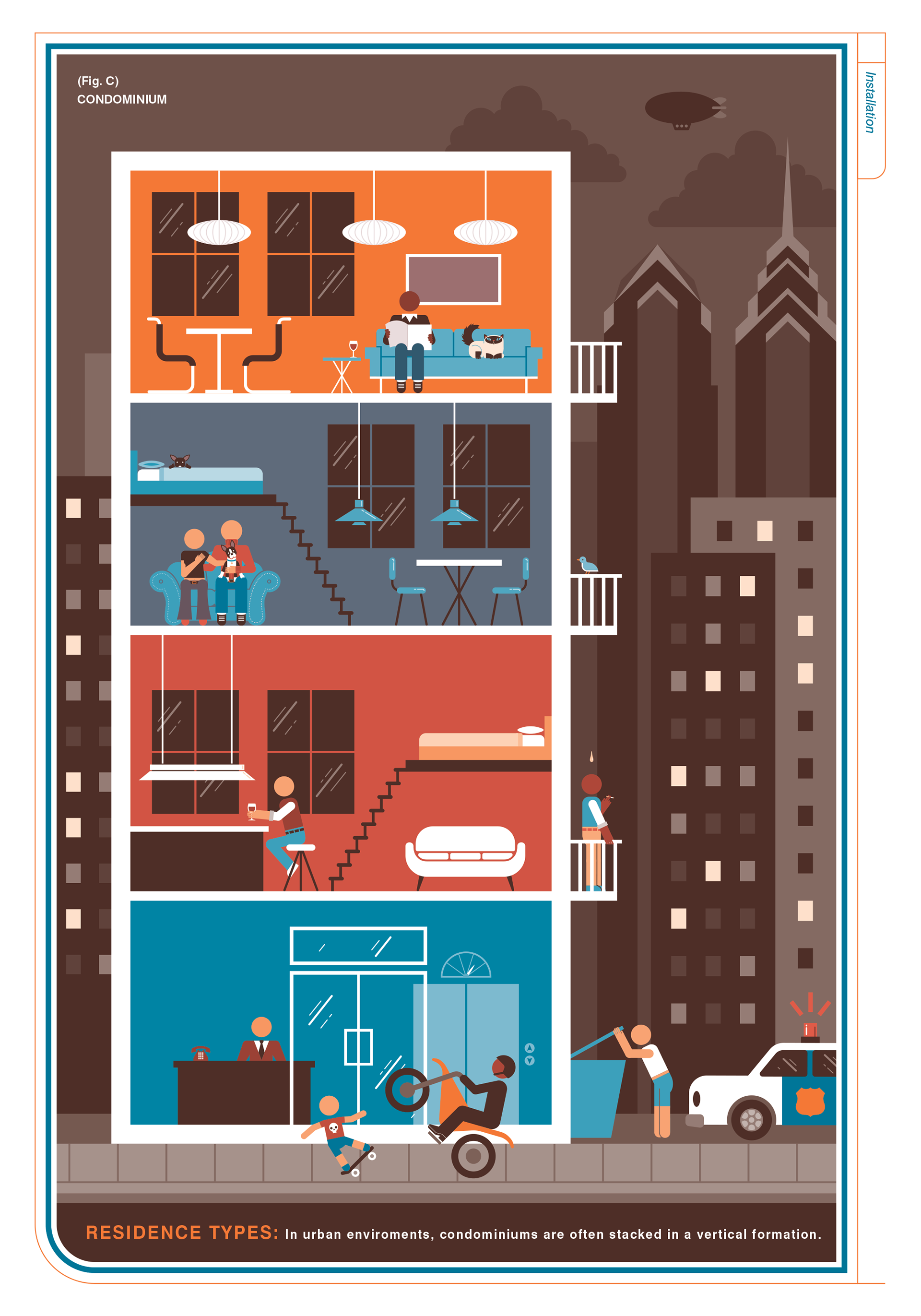
The illustrations in this title presented their own unique challenges, as there was a lot of information to convey, in multi-layered compositions. The color limitations imposed by the use of only two inks actually ended up helping in that regard.
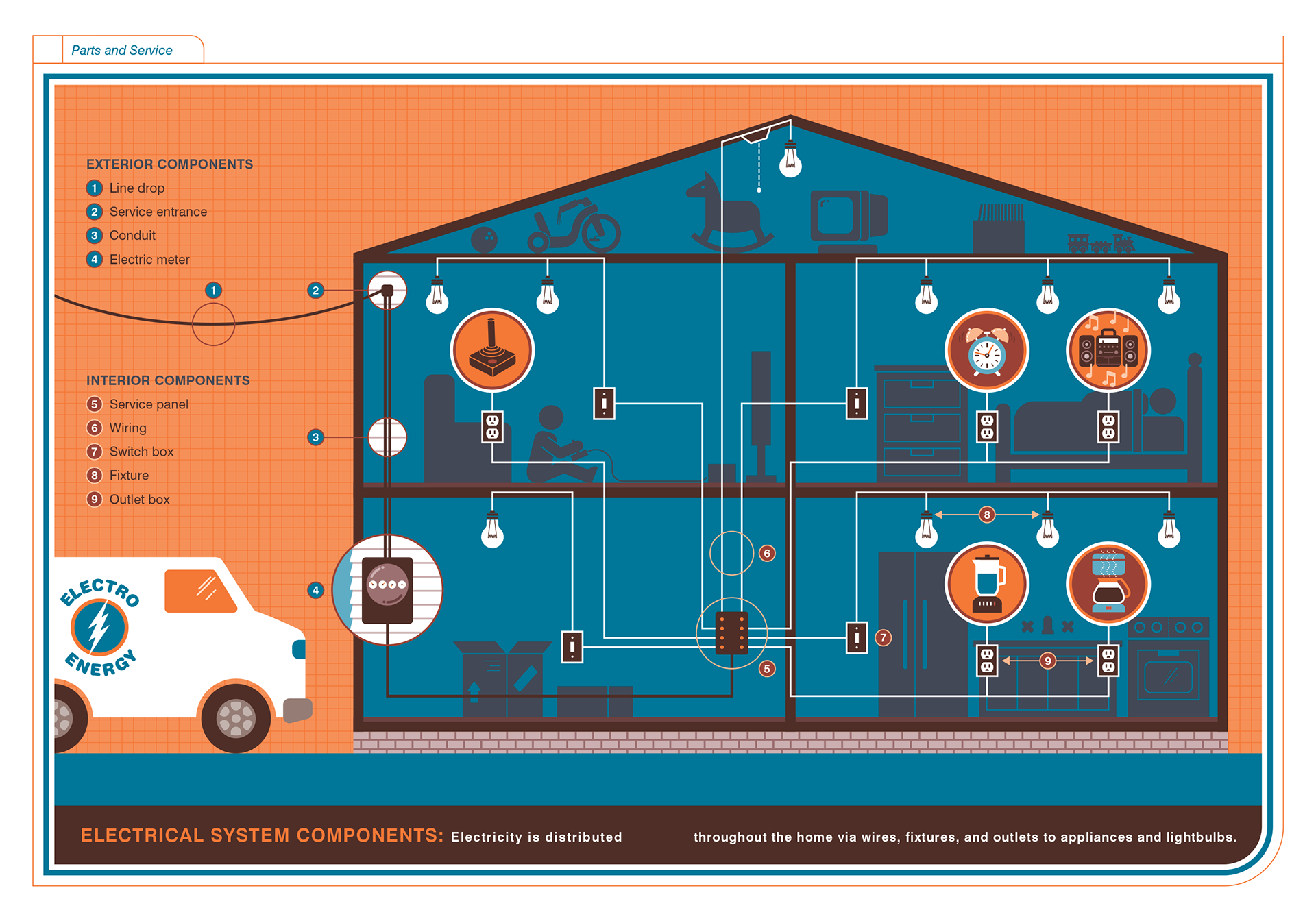
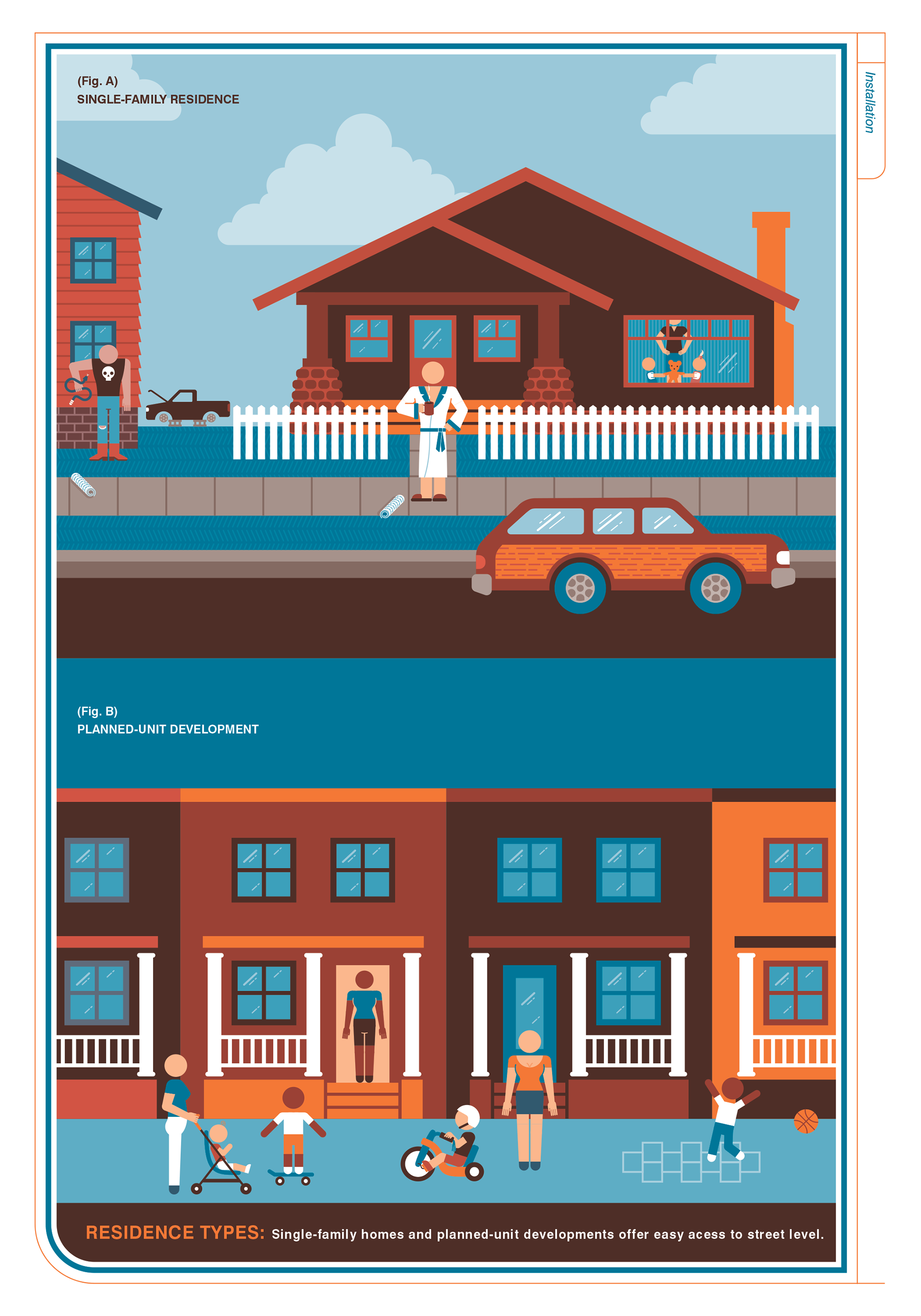
Since the Baby Owner's Manual was the first book in the series, we played it much safer with mixing the two ink colors. However, with this book we really took chances and were able to come up with a much more diverse color palette, which I think looked really nice.
The illustration, in the "Residence Types" section, for condominiums was even included in the American Illustration annual that year!