Client: Quirk Books
Recognition: Print's Regional Design Annual
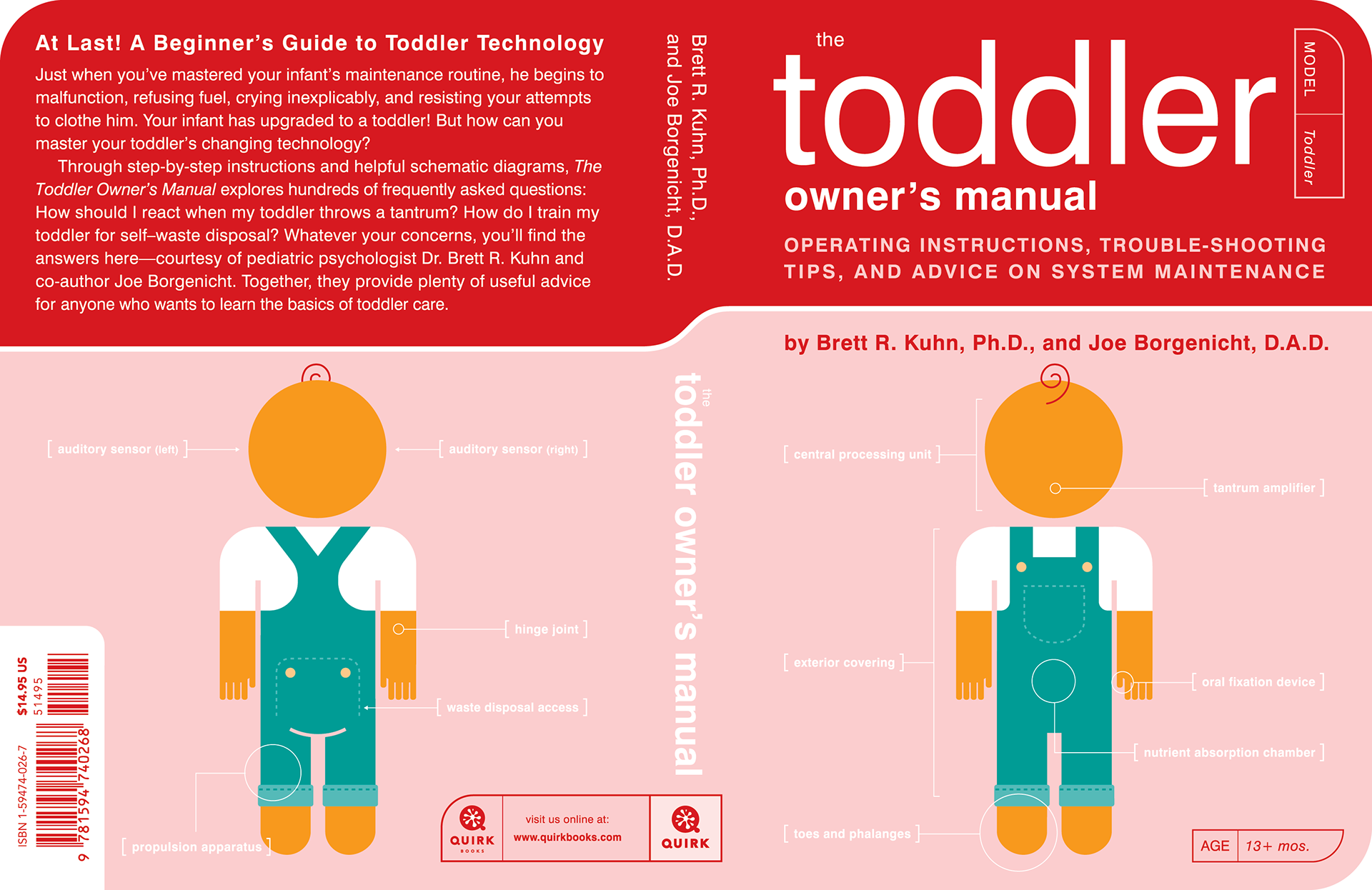
After the success of the first three books in the Owner's Manual series, it was decided there would be a true sequel to The Baby Owner's Manual.
The Toddler Owner's Manual picks up where Baby left off, at the beginning of Year Two.
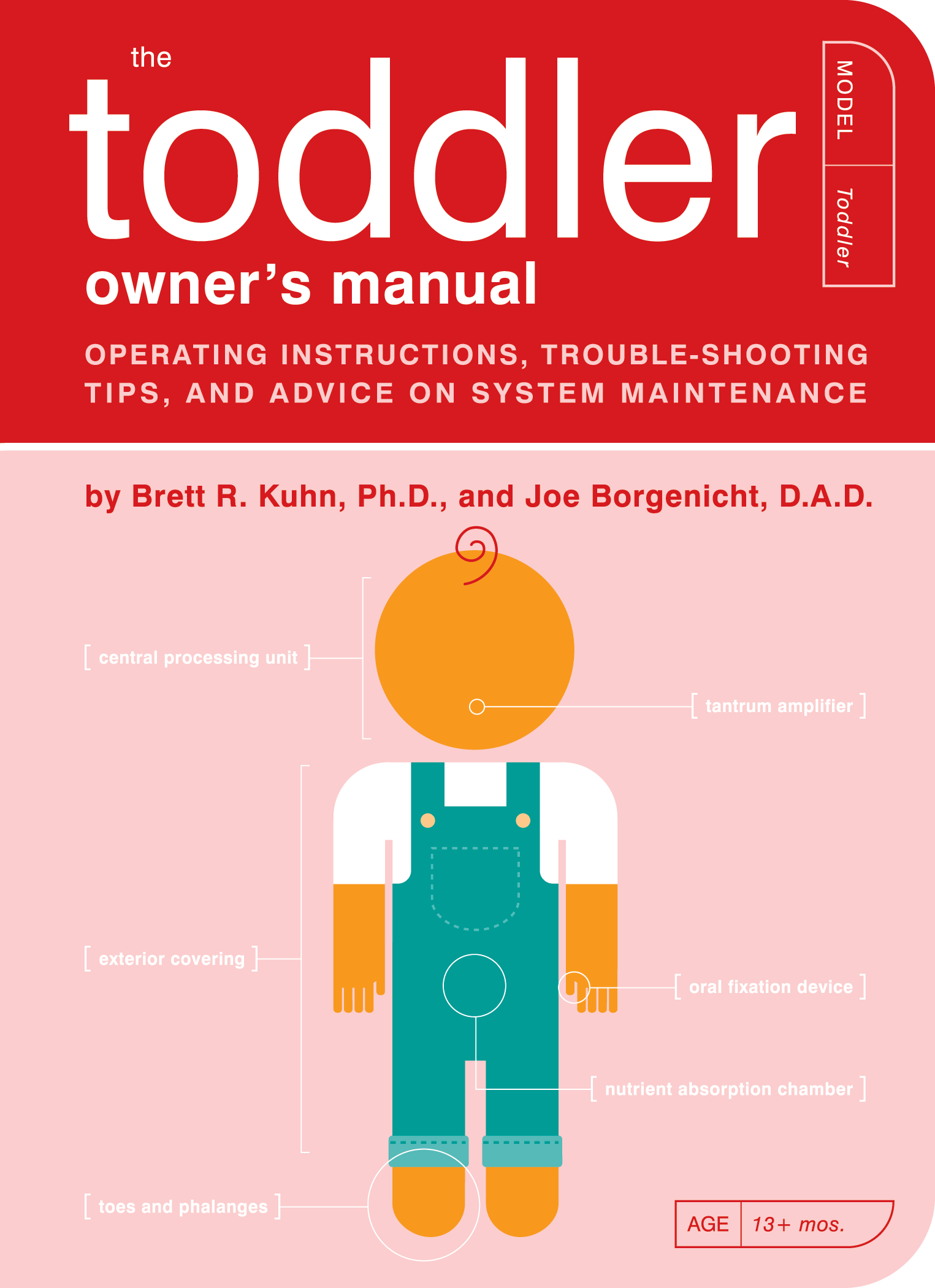
While we were still limited, to 2 ink colors for the interiors and 3 ink colors for the cover, we decided to try something a little different with the cover on this fourth book in the Owner's Manual series.
Our interior colors were orange and teal green. However, if we had used the teal as the main cover color, it would have looked too similar to The Baby Owner's Manual. So we used it for the toddler's overalls, but chose a vibrant red, and tints of it, as the main color for the cover.
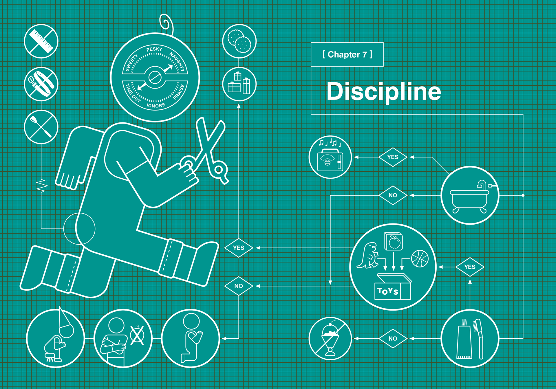
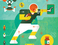
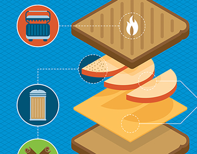
We continued to use our blueprint chapter opener concept, but began to evolve them further by adding even more humorous components and diagram elements.
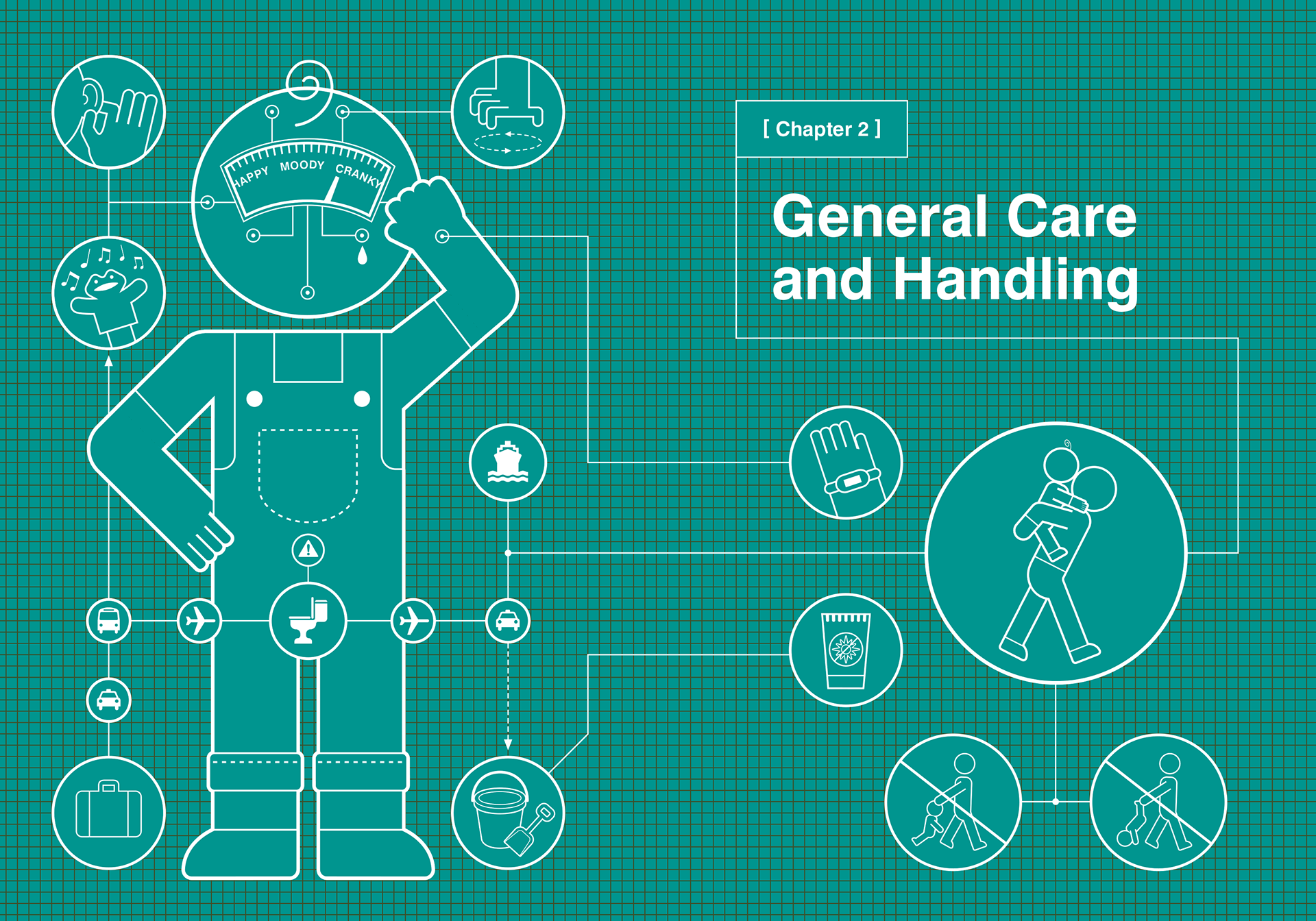
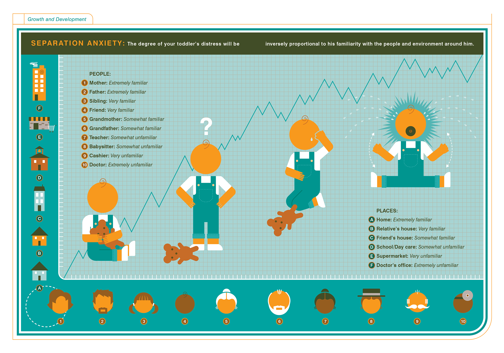
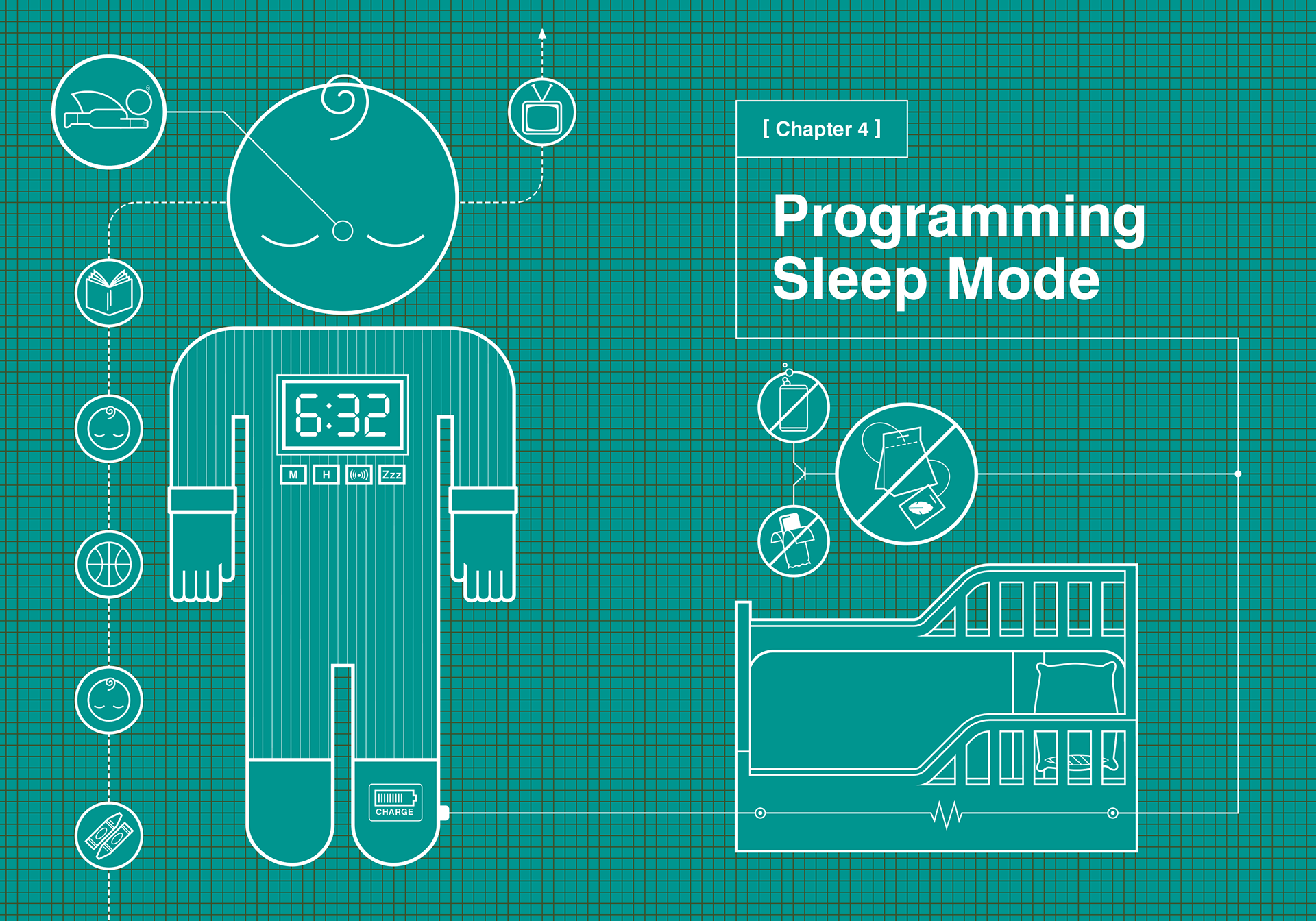
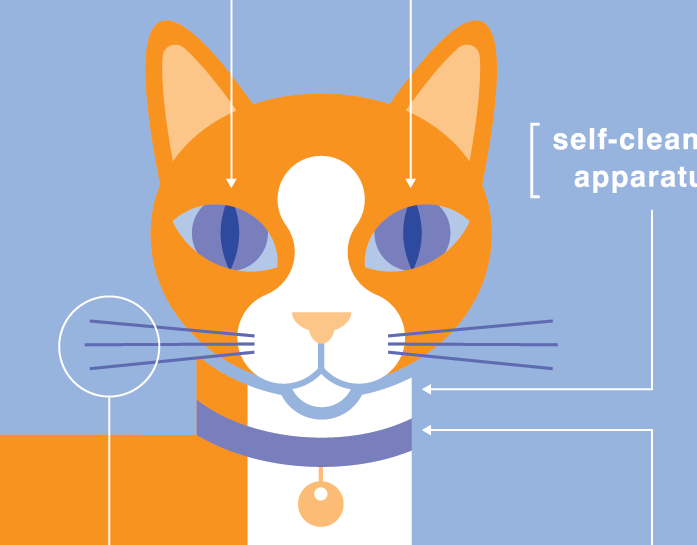
Being the fourth book in the series, we were able to have fun callbacks to previous titles such as "Sleep Mode" or incorporating the pets from the Cat and Dog books. But we really started pushing the design forward by incorporating more psychological and social concepts into the infographic concept.
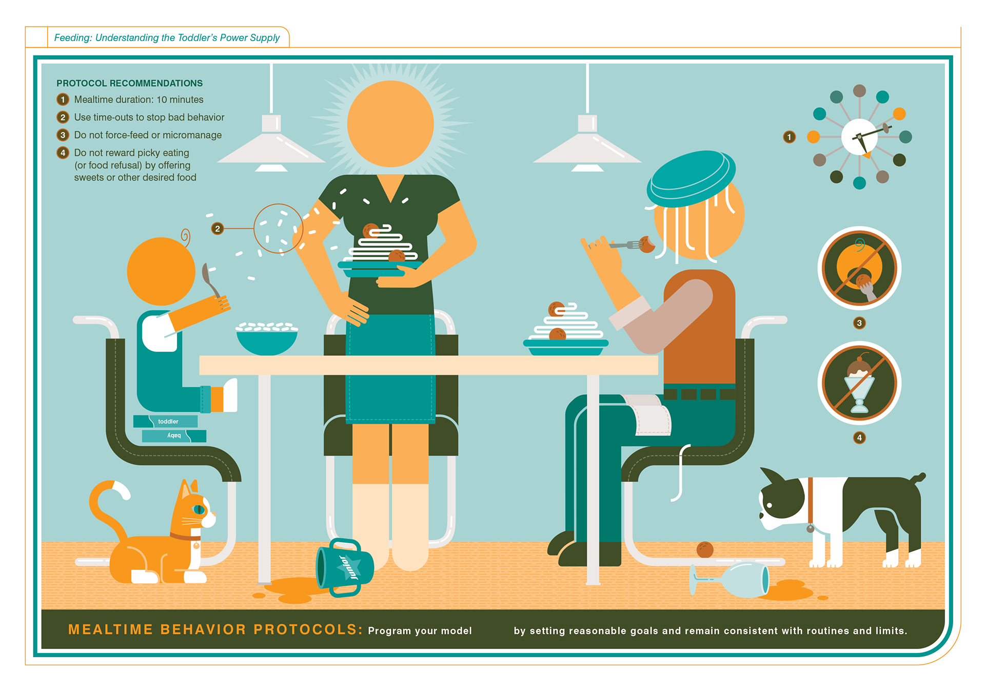
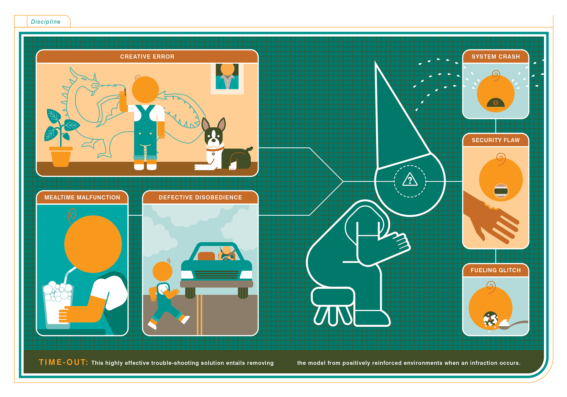
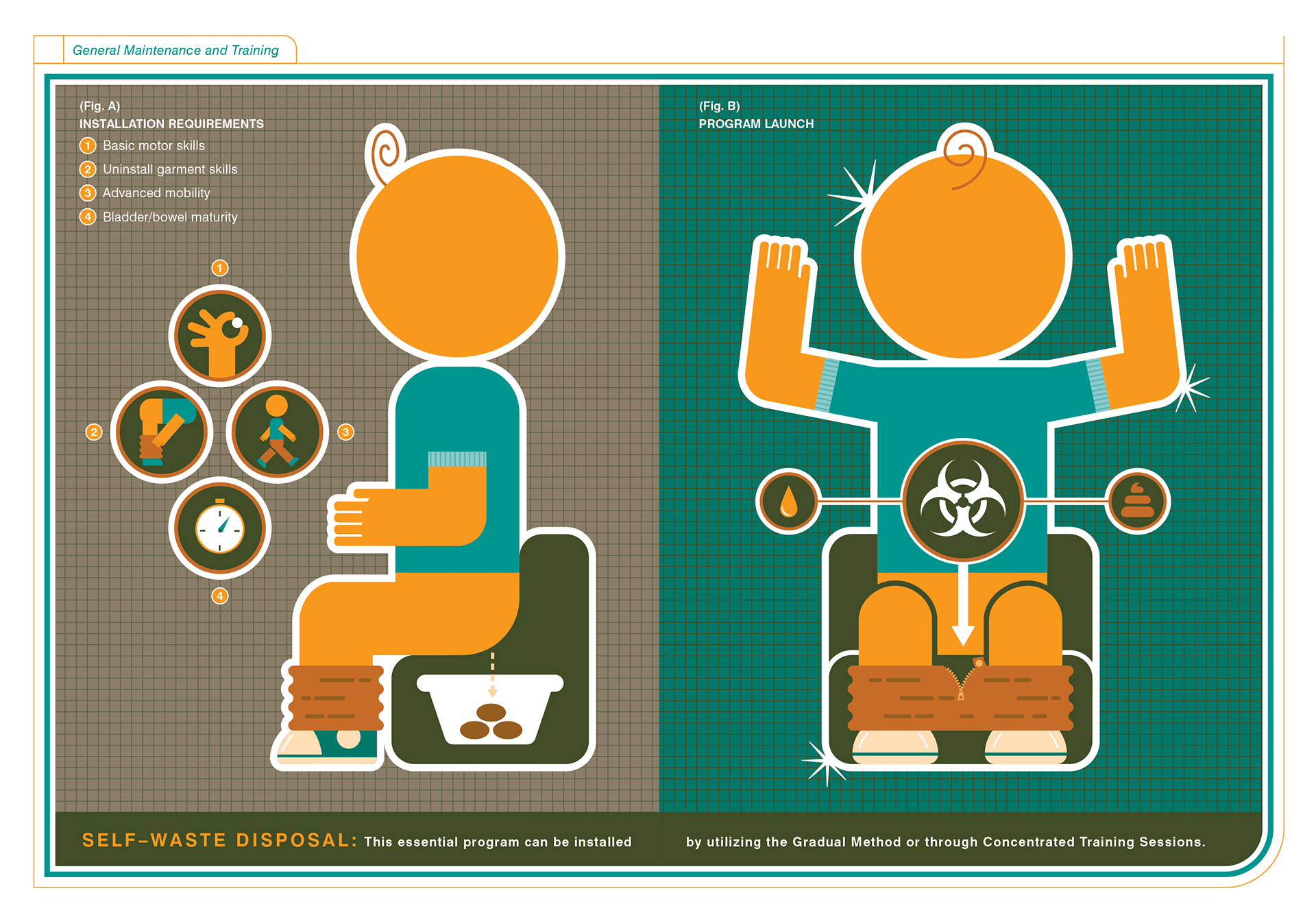
I think this project was when I realized you diagram or create an infographic about almost anything, and the more ludicrous the topic, the better the result.