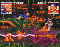
Client: Smash Magazine
Art Direction: Gary Stewart
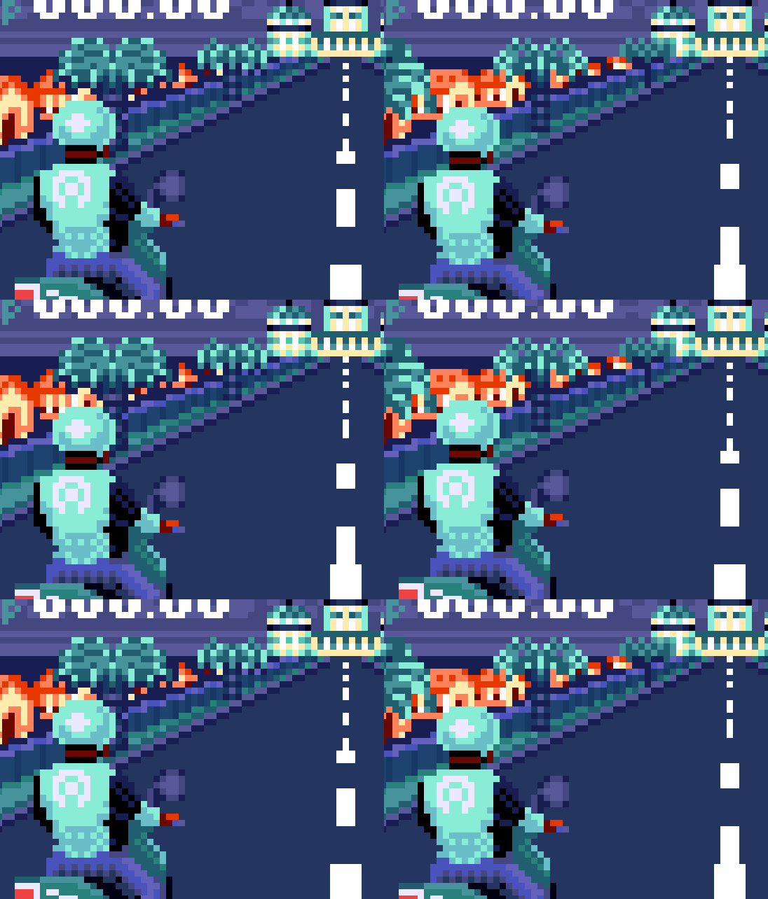
Opener for an article about the different "states of mind" one needs to switch between at different points in a match. I really enjoyed working on this one because it allowed me to bring in a lot of the elements that I feel my "pixel" style has going for it: using games as metaphors, using HUD (heads-up display) to display "emotional" data, and using video game controls/interface to capture the main concept (he's literally "selecting" which state of mind he needs to be in).

